GOOGLE PHOTO'S FLOATING BAR REDESIGN ARRIVES ON ANDROID
The compact pill-shaped navigation replaces the full-width bar, joining similar designs in Google Chat and Finance.
by editor5 min readcomments soon
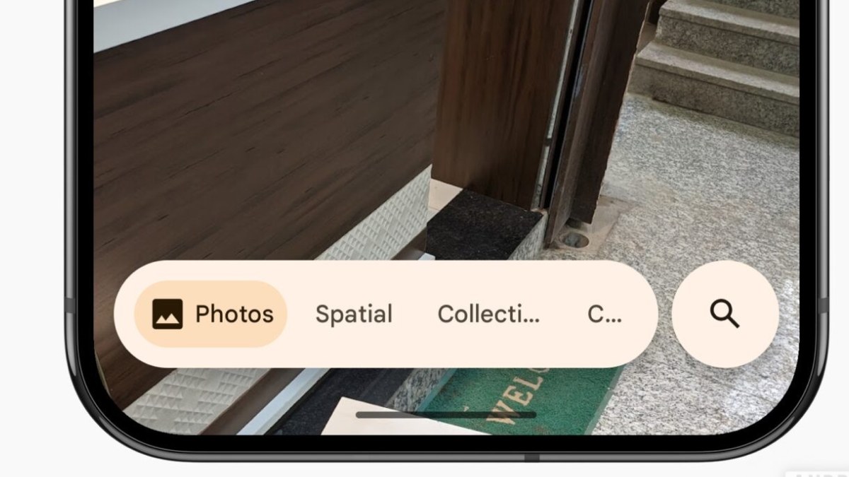
Google is finally rolling out the Photos bottom bar redesign that iOS users have been living with since February. The update replaces the old full-width docked bar with a floating pill that groups the core navigation into a far smaller footprint, and it is arriving on Android via version 7.82 of the app.
The redesign was broadly available to iOS users first, and Android owners who have been eyeing the change on the other side of the aisle can now get in on it. The rollout is server-side, meaning you might not see it the instant you update the app, but the new layout is landing widely on devices now.
WHAT CHANGED
The old bottom bar spanned the full width of the screen and laid out buttons across the bottom like a traditional navigation rail. The new one is a floating oval pill that sits just above the bottom edge of the display. Inside the pill are three tabs: Photos, Collections, and Create. There is a separate circular Search button floating to the right of the pill, and the whole assembly takes up roughly a third of the space the previous bar used.
Because the pill is floating and translucent in effect (the background shows through around it), more of your photo grid is exposed underneath and to the sides. The buttons stay put near the bottom regardless of which tab you are viewing, which is a meaningful change from the old design. The previous version of the bar would disappear entirely when you scrolled back through your timeline, making it harder to jump between sections without first scrolling to the top. The new persistent pill means the navigation is always one tap away.
The search circle on the right is also worth noting because it doubles as the entry point for Gemini-powered Ask Photos, Google's AI-backed photo search feature. That puts the AI search front and centre in a way the old layout did not.
THE OLD BAR VERSUS THE NEW ONE
The contrast between the two designs is less about aesthetics and more about usability in practice. The old bar was a standard material navigation pattern: a fixed bar at the bottom with icons and labels that stayed visible until you scrolled, then it faded away. That meant if you wanted to jump from your photo timeline to the Collections tab or use the search function, you had to scroll back to the top to make the bar reappear. For anyone with a long photo history, that is a surprisingly frequent annoyance.
The new bar never leaves. It stays on screen as you scroll, and because it uses a floating pill rather than a full-width strip, it does not cut off content on either side. The space around the buttons continues to show your photos, giving the layout a more immersive feel. The tradeoff is that the pill is smaller and the tap targets are more compact, though the buttons themselves are generously padded and work fine at thumb reach.
One small but notable change: the day indicator (the label that shows "Today" or when you scroll) has also been updated. It now appears in a floating pill at the top that fades out after a moment. If you prefer the old left-aligned date labels, you can go into the three-dot overflow menu and toggle to bring them back, though the new version centres the date instead of aligning it left.
PART OF A BIGGER DESIGN LANGUAGE
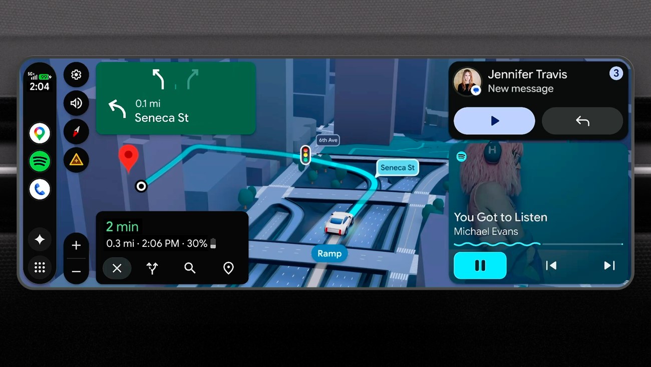
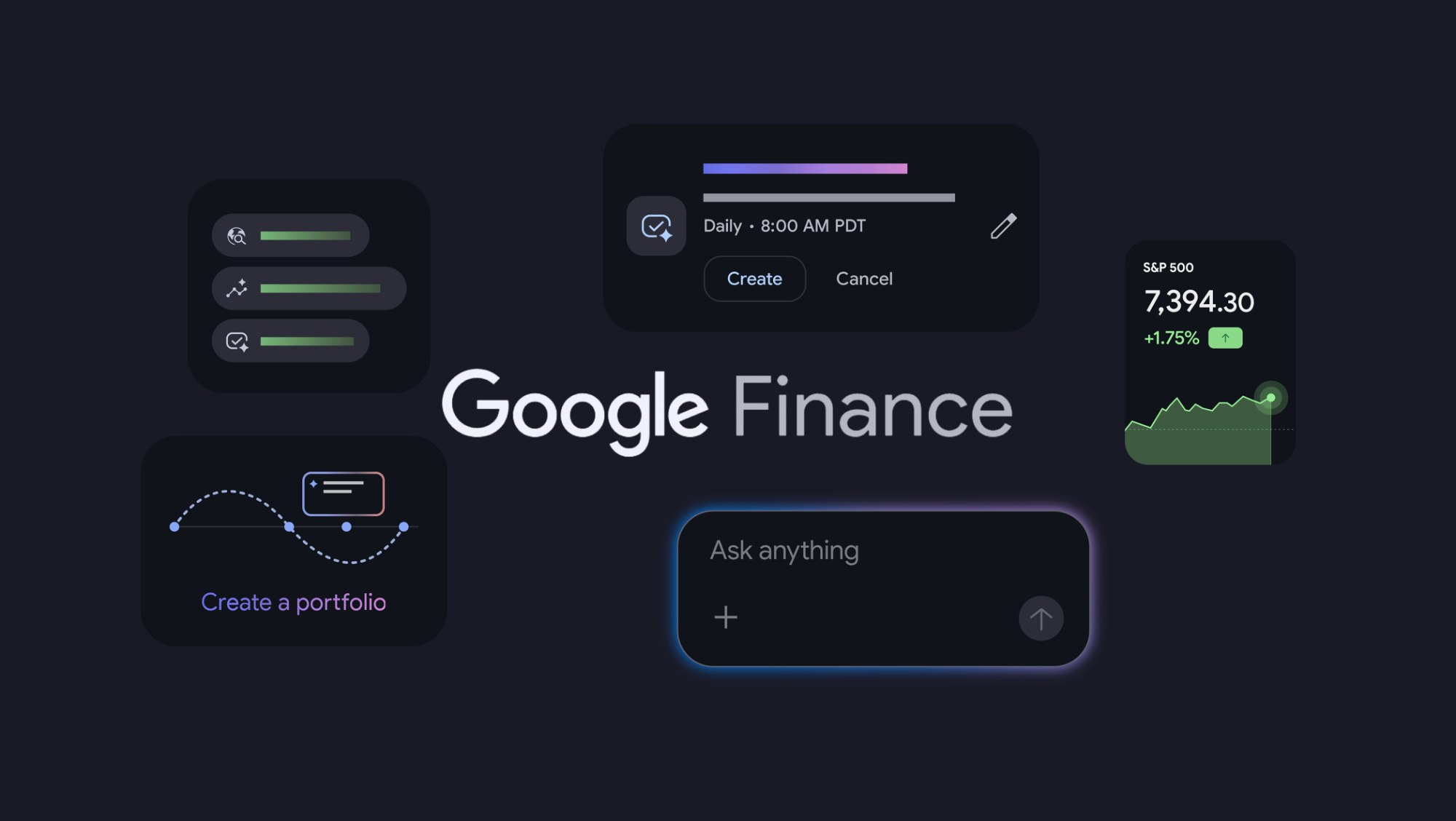
This floating bar is not an isolated experiment. Google has been pushing a similar pill-shaped bottom navigation into Google Chat and Finance. The design language sits somewhere between standard Material Design and the newer Material 3 Expressive components, though the closest official component from the library is the floating toolbar, which is not designed for primary navigation.
Still, the approach makes sense. A docked bar that disappears on scroll solves a real discoverability problem, but creating a persistent floating element that does not block content is a reasonable compromise. Google Photos is just the latest product to get the treatment.
WHAT NEXT
If you do not see the new bar yet, check that you are on version 7.82 of Google Photos. The update is server-side, so the toggle depends on Google's backend, not just the app version. Most users should see it within the coming days.
The wider significance is that Google is slowly but consistently consolidating its navigation patterns across apps. For Photos specifically, this is a meaningful upgrade for anyone who uses the app as a primary gallery. The persistent bar saves a tap per navigation, and the smaller footprint means you see more of your photos at all times. The only frustration is that Android users had to wait months after iOS got the same update. But for now, it is here, and it works.
The pill might not be a radical rethinking of photo management, but it is the kind of thoughtful, incremental improvement that makes a daily-use app feel less clunky. And that is worth a server-side rollout.
what did you make of it?
more from consumer tech
consumer tech
GOOGLE ADDS YOUTUBE MUSIC, INSTACART & CANVA TO AI MODE SEARCH
Starting this week, US users can ask AI Mode to make a playlist, fill a grocery cart, or design a flyer without leaving the search…
consumer tech
ONEPLUS DEAD IN THE WEST, OPPO OVERLORDS PULL PLUG
The brand that built its reputation on has settled for leaving its biggest markets. Existing phones still work. New ones won't come.
consumer tech
GOOGLE PIXEL 10 PRO DROPS TO 699, BEST DEAL YET!
A $300 discount on the 128GB model undercuts Prime Day pricing and signals a clear runway to the pixel 11 launch.
consumer tech
APPLE RAISES APPLE ON BUNDLE FOR FAMILY AND PERMIER PLANS
the Family plan jumps $2 to $27.95 a month and the Premier to $39.95; Apple hasn’t explained the bundle increase beyond citing music licensing for…